Tutorial
Network Configuration
Network object supports following properties for configuring the network diagram.
- scale: scaling factor for layout algorithm
- fontsize: fontsize for labels
- edgelw: linewidth of edges
- nodeColor: node color
- reactionNodeColor: reaction node color
- labelColor: label color
- labelReactionIds: boolean flag for labeling reaction ids
- reactionColor: edge color
- modifierColor: modifier edge color
- boundaryColor: boundary node color
- nodeEdgeColor: node edge color
- nodeEdgelw: linewidth of node edges
- highlight: list of species ids or reaction ids to highlight
- hlNodeColor: node color of highlighted nodes
- hlNodeEdgeColor: node edge color of highlighted nodes
- drawReactionNode: boolean flag for drawing reaction nodes
- breakBoundary: boolean flag for breaking all boundary species into separate nodes
- tightLayout: boolean flag for tighter node layout
- analyzeFlux: boolean flag for visualizing flux
- analyzeRates: boolean flag for visualizing species rate of changes
- analyzeColorHigh: color to use for higher values during analysis
- analyzeColorLow: color to use for lower values during analysis
- analyzeColorMap: colormap to use for analysis.
- analyzeColorScale: boolean flag for using colormaps. Setting this true ignore analyzeColorHigh and analyzeColorLow
- drawInlineTimeCourse: boolean flag for plotting inline time-cource simulation
- simTime: value for simulation duration
- forceAnalysisAtSimTime: boolean flag for running analysis at the end of simTime
- plotColorbar: boolean flag for visualizing color bar
- inlineTimeCourseSelections: list of species to plot for time-course simulation
- customAxis: use custom matplotlib.pyplot.axis object for the diagram
- layoutAlgorithm: specify layout algorithm
You can define these properties and run draw() to generate customized network diagrams.
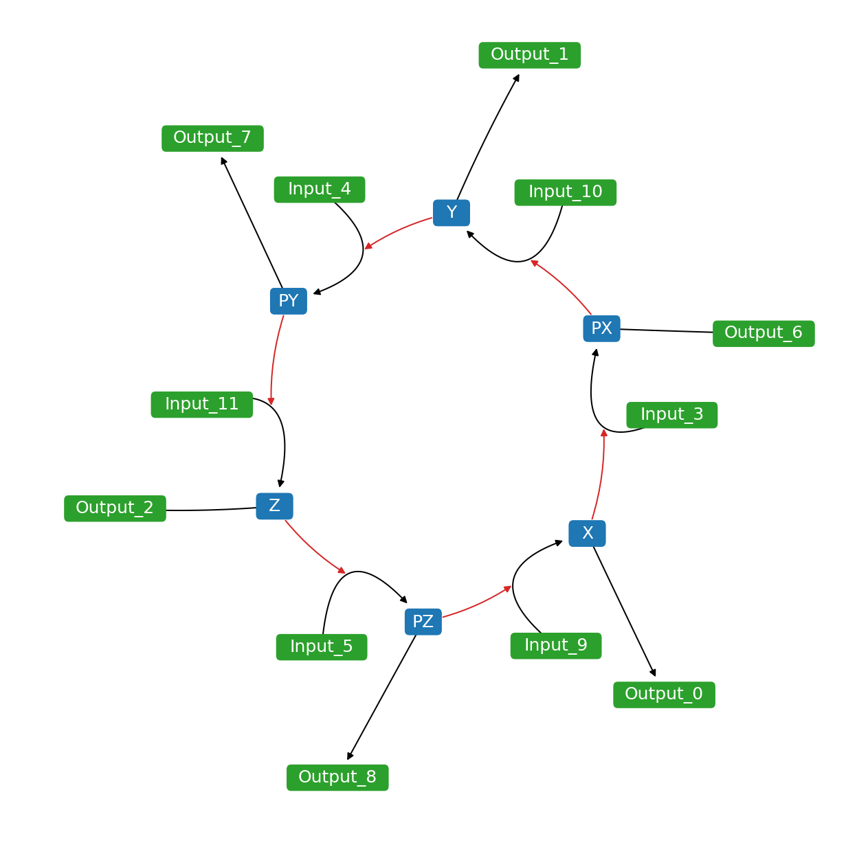
Detached Boundary
Detach common boundary species by setting breakBoundary=True.
net = npl.Network(npl.testmodels.REPRESSILATOR)
net.draw()
net.breakBoundary = True
net.draw()
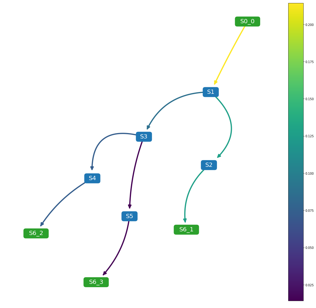
Flux Visualization
Visualize flux using colormap via setting analyzeFlux=True. Set analyzeColorScale=True to scale the colormap to minimum and maximum values. You can supply your own colormaps. To plot colorbar, set plotColorbar=True.
net.analyzeColorScale = True
net.analyzeFlux = True
net.analyzeColorMap = 'viridis'
net.plotColorbar = True
Rate of Changes Visualization
Visualize species rates of change using colormap via setting analyzeRates=True. Set analyzeColorScale=True to scale the colormap to minimum and maximum values. The resulting plot will show species rate of change at t=simTime. You can supply your own colormaps. To plot colorbar, set plotColorbar=True.
net.analyzeColorScale = True
net.analyzeRates = True
net.analyzeColorMap = 'viridis'
net.simTime = 3000
net.plotColorbar = True
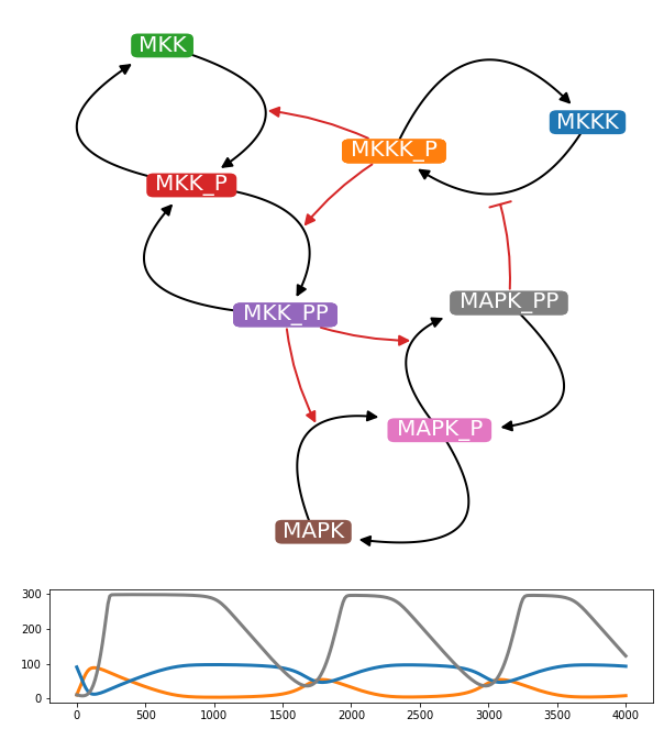
Inline Time-course Plot
Plot inline time-course plot along with network diagrams with matching colors by setting drwaInlineTimeCourse=True. The simulation runs for t=simTime. You can selection specific species to plot by passing a list to inlineTimeCourseSelections property.
net.drawInlineTimeCourse = True
net.inlineTimeCourseSelections = ['MKKK_P', 'MKKK', 'MAPK_PP']
net.simTime = 4000
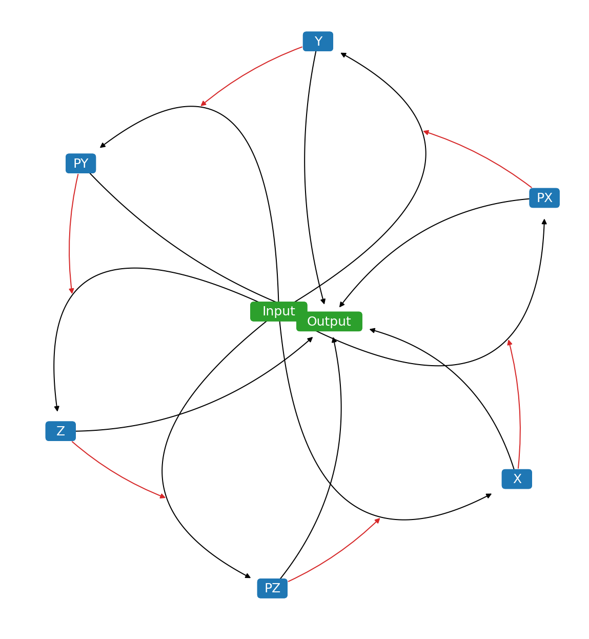
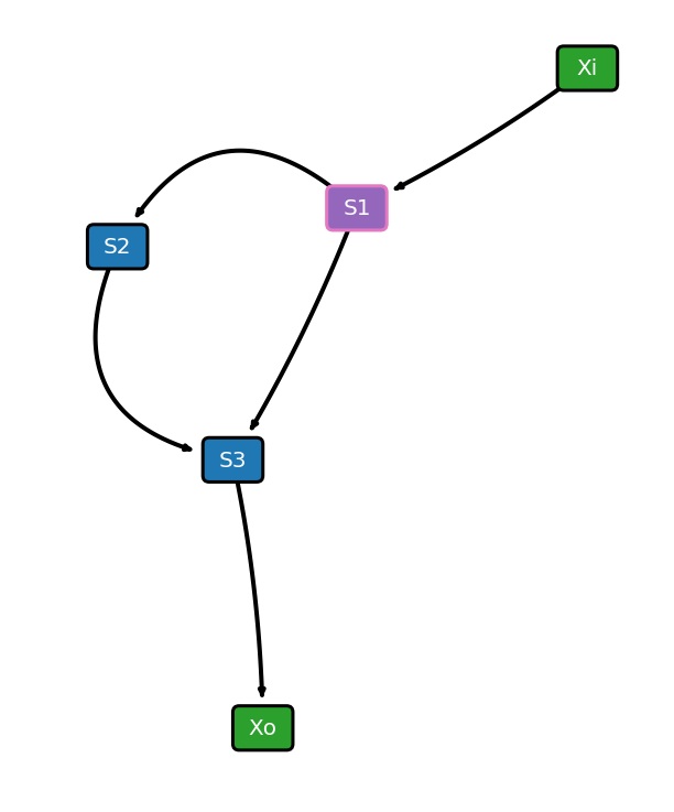
Highlighting
Highlight specific nodes by passing a list to highlight property. Choose the highlight colors using hlNodeColor and hlNodeEdgeColor properties.
net.drawReactionNode = False
net.nodeEdgelw = 3
net.highlight = ['S1']
net.draw()
Selecting Layout Algorithm
Currently, netplotlib supports following layout algorithms:
‘kamada-kawai’
‘spring’
‘dot’
‘neato’
‘twopi’
By default, netplotlib uses Kamada-Kawai layout algorithm. Certain layout algorithms require external graphviz to be configured and pygraphviz package installed.
NetworkEnsemble Configuration
NetworkEnsemble object supports following properties for configuring the network diagram.
- scale: scaling factor for layout algorithm
- fontsize: fontsize for labels
- edgelw: linewidth of edges
- nodeColor: node color
- reactionNodeColor: reaction node color
- labelColor: label color
- labelReactionIds: boolean flag for labeling reaction ids
- reactionColor: edge color
- modifierColor: modifier edge color
- boundaryColor: boundary node color
- nodeEdgeColor: node edge color
- nodeEdgelw: linewidth of node edges
- highlight: list of species ids or reaction ids to highlight
- hlNodeColor: node color of highlighted nodes
- hlNodeEdgeColor: node edge color of highlighted nodes
- edgeLabel: boolean flag for displaying edge weights
- edgeLabelFontSize: fontsize of edge weight labels
- drawReactionNode: flag for drawing reaction nodes
- breakBoundary: boolean flag for breaking all boundary species into separate nodes
- weights: list of custom weights to override
- edgeTransparency: boolean flag for changing the transparency of the edges accordin to edge weights
- plottingThreshold: value of threshold to prevent from displaying weighted edges
- removeBelowThreshold: boolean flag for preventing weighted edges below plottingThreshold from displaying
- analyzeFlux: boolean flag for visualizing flux
- customAxis: use custom matplotlib.pyplot.axis object for the diagram
- layoutAlgorithm: specify layout algorithm
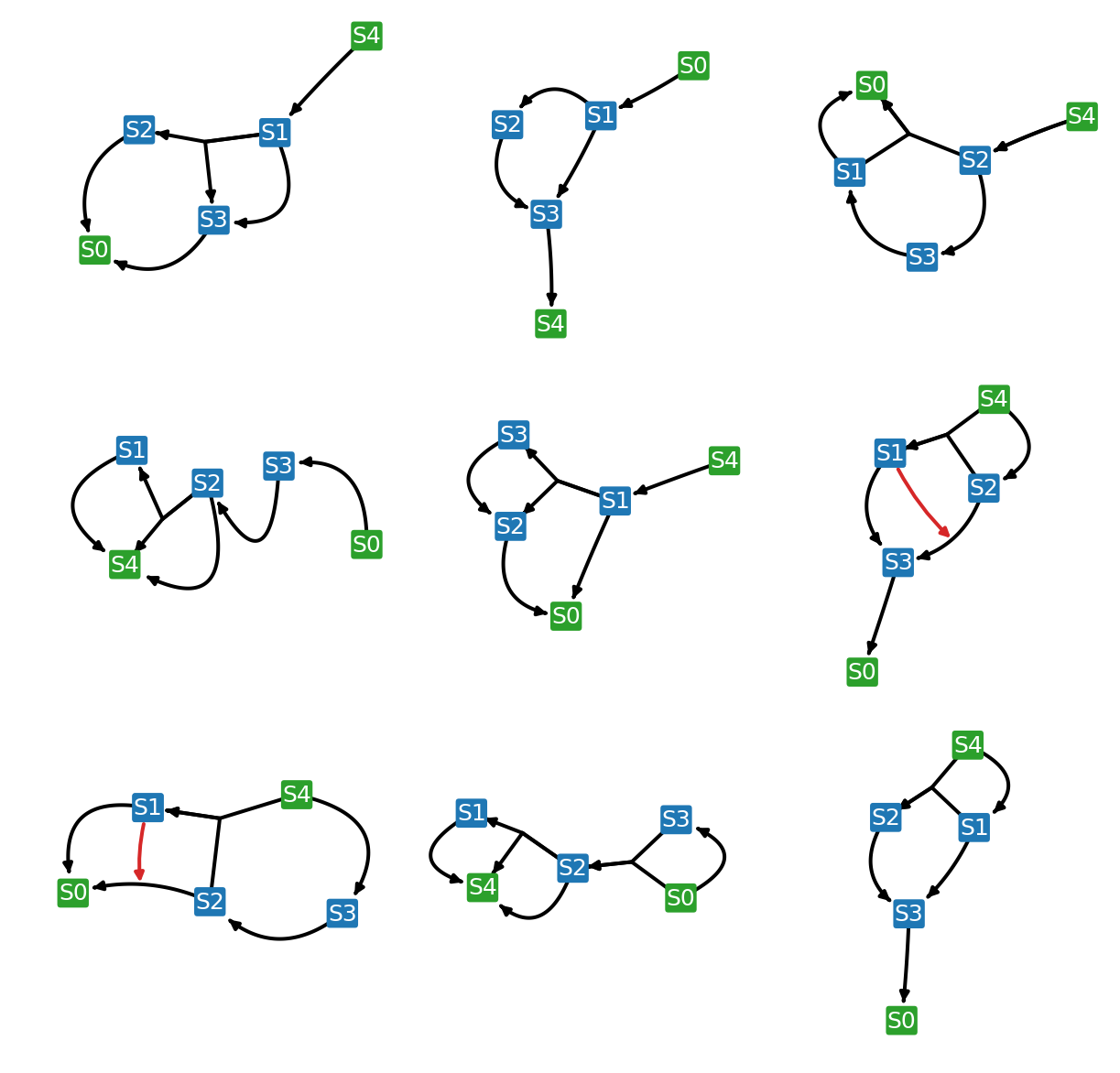
Grid Plot
Plot a grid plot of network diagrams of individual models in the list by running drawNetworkGrid() function.
net.drawNetworkGrid(3, 3)
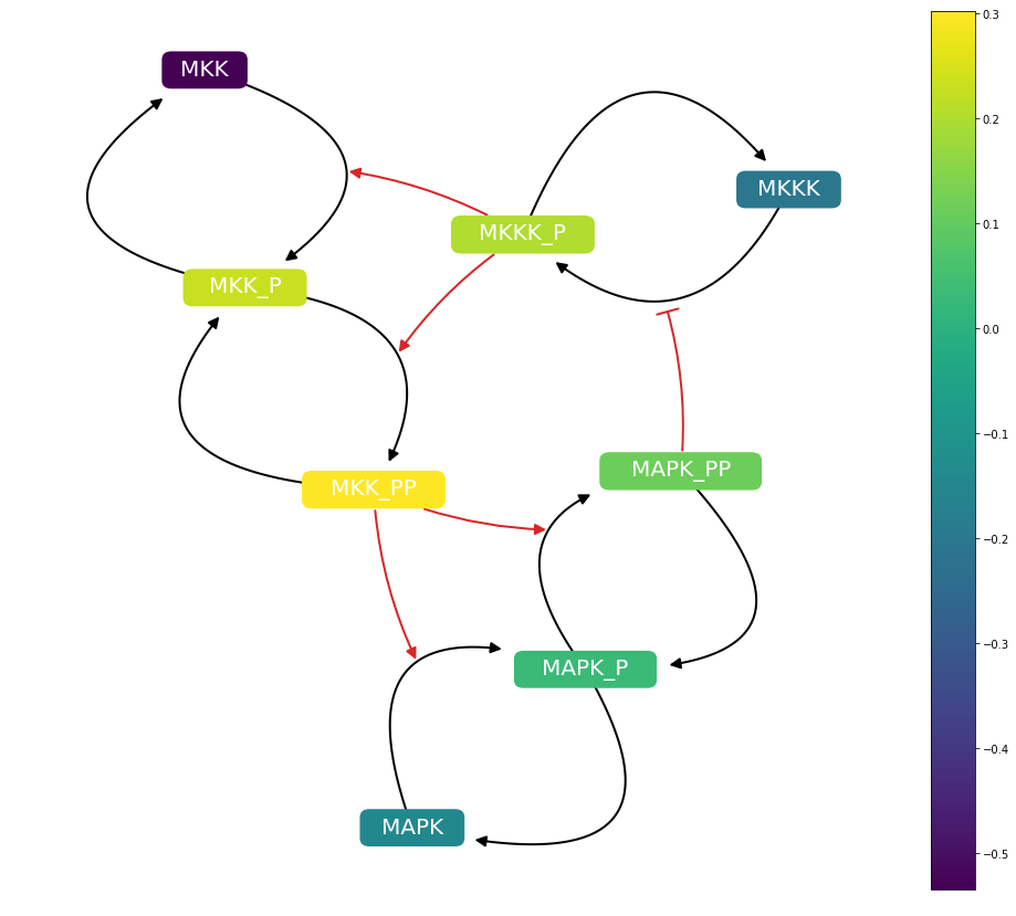
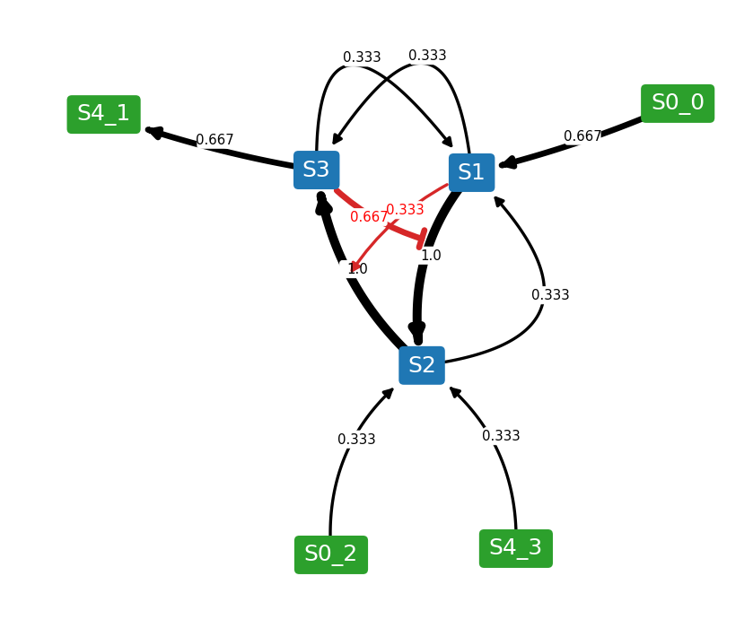
Weighted Network Diagram
Combine models in the list and generate a one network diagram where the edges are weighted according to the frequency. To generate a weighted network diagram, run drawWeightedDiagram() function. Below are images of an example where an ensemble of three models are combined into a weighted network diagram.
net.drawWeightedDiagram()
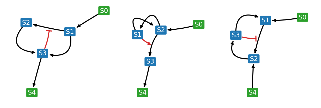
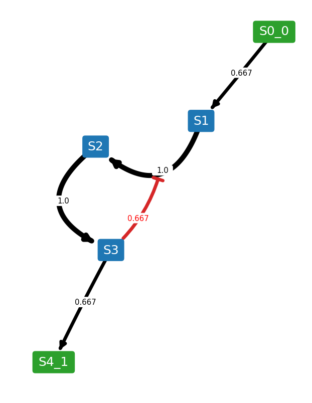
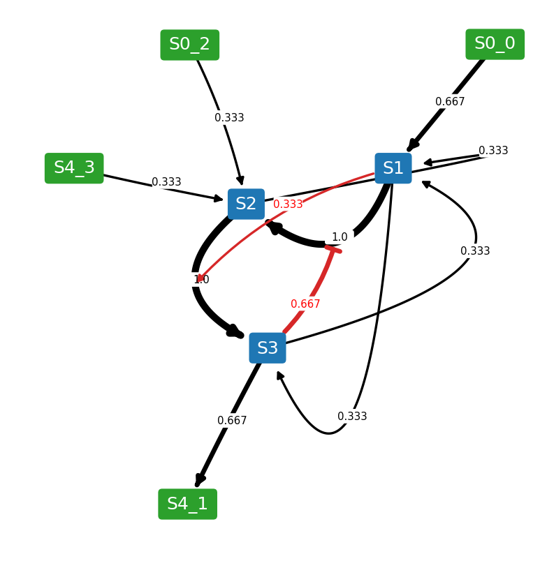
It is possible to set a threshold where edges below the threshold are removed from the resulting network diagram. To set a threshold, use plottingThreshold and removeBelowThreshold properties. For example, if plottingThreshold=0.5 and removeBelowThreshold=True, any edges that appear in less than half of the model ensemble will be ignored. However, sometimes you might want to put the ignored reactions back while keeping the layout. To do so, set removeBelowThreshold=False while keeping the plottingThreshold.
net.removeBelowThreshold = True
net.plottingThreshold = 0.5
net.drawWeightedDiagram()
net.removeBelowThreshold = False
net.drawWeightedDiagram()
Test Cases
Netplotlib comes with set of test cases. All test cases are available under netplotlib.testmodels submodule.